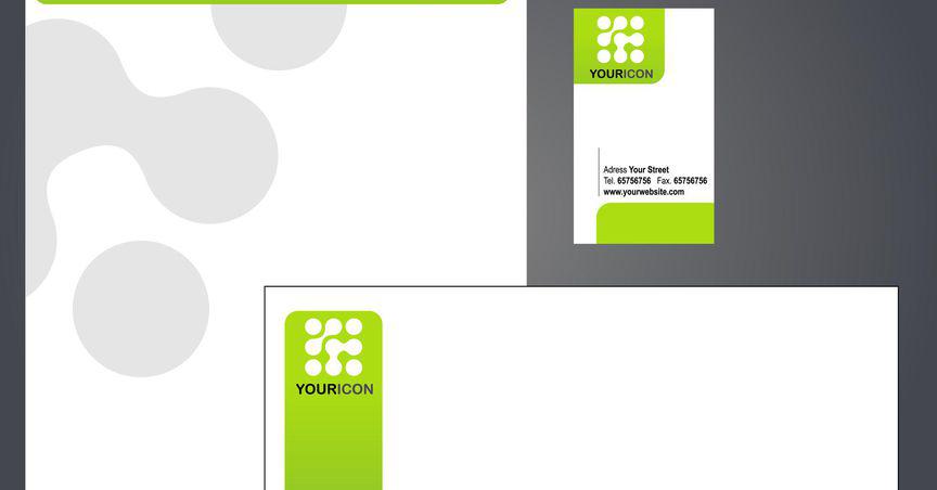
A letterhead can be considered as an extension of your business logo. It is the impression that you want your customers to get about your business when they see it printed in black and white on correspondence paper. A clean, well-designed letterhead will make a good impression on anyone who receives the correspondence with your company name and information on it.
Some people prefer to design their letterhead design while others prefer to buy pre-designed templates online. Designing a letterhead is simple but you should stick to the rules of design and use elements like logos, colors, fonts properly so that your business looks neat and professional rather than messy. The first thing that needs to be done is to gather all the items that are needed for designing a letterhead, like the logo of the company, contact information like address and phone number, fax number, etc., colors (two or three) if you choose not to use black ink only on white paper. You can use bright colors or pastel
What Is The Purpose Of A Professional Letterhead Design?
People tend to judge things by their first impressions, meaning if they receive something looking sloppy or unprofessional, then the person viewing it will assume that the content of what is being sent out was sloppily assembled too. This works both ways though. If someone sends out a letterhead that looks amazing, then people are more inclined to believe that their content will have a professional feel to it as well.
What Makes A Creative Letterhead Design Attractive?
A letterhead design should be simple yet attractive. There is no reason for a letterhead design to be overly ornate or complicated unless your business logo is adorned with lots of graphic elements. The best way to make a good impression on someone is by sending them something that looks clean and well laid out, not something that makes them think about how much time you spent designing it because the only thing they will see in the end is how sloppy it looks.
The first thing anyone sees when they look at a letterhead design is the company name and address which need to look amazing for people to give them much consideration. Focus on making your company name and address the most visually appealing thing on your letterhead design. Make something that will draw attention to it in a positive way.
How To Make A Business Letterhead Design That Compliments Your Business Logo?
The easier it is for you to develop a clean, professional-looking letterhead design the better. If you are good with graphic software, then this should not be too hard for you to do without much hassle. You can either create one yourself by taking elements of your business logo, like the font used in it or some of its features and layering them onto plain white paper at an attractive angle or make up some nice textured paper, print off several copies of it and write out what needs to be written by hand.
It might be a good idea to write out what you want on your letterhead design by hand on a sheet of paper first so that you have an idea of how it will look when finished. This way you can keep from being frustrated while working on it because oftentimes people think certain things will look a certain way, but in reality, turn out looking differently.
How To Make Letterhead Design Samples With Your Company Logo?
You can either have the company logo printed onto the plain white letterhead or draw one yourself using graphics software and then print multiple copies at home. If having someone else print them for you is more desirable, make sure they are printed on high-quality office-grade paper. The last thing want is the ink from the letterhead smearing or running when it gets wet.
How To Make A Letterhead Using Letterhead Design Ideas?
You can easily create a letterhead design online by changing the page layout settings of the document you are working on to landscape orientation instead of the portrait so that it will print out with each page being its own letterhead. Then all you have to do is write out what needs to be written by hand, print off several copies and start addressing your envelopes. You could even just type up the addresses onto pre-made labels if you wanted to cut down on time spent writing them out by hand, but this would defeat some of the purposes of sending something nice because people might think that anyone could do that for you, which means you took the easy way out.
Venngage offers a lot of letterhead design ideas for your business letters. Don’t forget to check it out.
Conclusion
If you're going to be sending letters out as part of your business, it's important to have a professional-looking letterhead. This might work well if you are sending lots of correspondence like promotional materials or a newsletter. It will make your whole mailing look very professional since all the pieces (envelope, letterhead design, and content) match up well together.


