


Magellan Financial Group Ltd (ASX:MFG) is one of the few multi-baggers on the ASX that has given exponential returns to the investors. When the company got listed in 2004, it was trading below A$1 for almost two years, now almost 1.5 decades later the price touched the high of A$36.3 level (as of 8th March 2019) which is its all-time high price, giving an astounding absolute return.
However, the majority of the returns started coming in from 2nd half of 2012 in which the stock was trading around A$2 and rallied up to A$28 odd levels till December 2015. This rally was so sharp that Relative Strength Index (RSI) in that above mentioned time period displayed a reading of more than 94 (at its peak) on a monthly chart. Any reading above 80 is considered to be very high and reading above 90 is extremely high and therefore rarely seen. To put it in perspective, the RSI never showed the reading above 90 (2nd time) in the entire listed history of the stock.
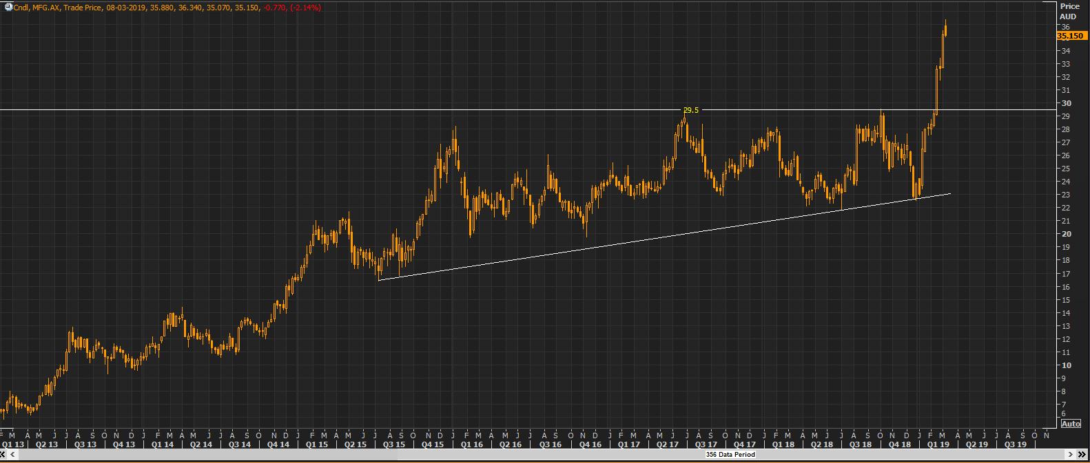
After such a huge rally, it was expected for the stock to either take correction from the peak of A$28 odd levels or at least consolidate in a range for some time and halt the further rally. The reason being, a huge buying for the stock for a prolonged period ultimately leads to decrease in the demand given almost everyone being already invested in the stock, and ultimately increases the supply due to profit booking by existing investors. The stock chose the latter and consolidated for almost four years in a broad range of A$29.5 â A$19.7 which also states a continuous interest in buying coming in from the lower levels and regular selling has been seen from the upper levels.
Between this fight of bulls and bears which continued for almost four years the bulls were evidently seen stronger than the bears. The resistance level remained around the A$29.5 levels throughout the year, but on the contrary, the support levels kept on shifting on the higher side. This price action depicted the investorsâ urgency for buying the stock.
 MFG Daily Chart as at March 08, 2019 (Source: Thomson Reuters)
This entire price action of four years has formed an âAscending Triangleâ chart pattern in which the resistance level remains the same, but the support level keeps on shifting up, in the form of an upward moving trendline. The breakout of this pattern is generally on the upside which is seen in this case. In February 2019, after the announcement of 2019 interim results of the company, the price opened gap up and pierced through the four years strong resistance level of A$29.5, indicating a clear change in the sentiments of investors. Since then the price hasnât come to that level and rallied as much as to A$36 in a few days. This breakout was so sharp that the prices rallied in one direction and consequently, the RSI readings went over 85 on daily chart. This reading shows that the stock is in an overbought zone which interprets that prices have risen so sharply within a short duration that an expected correction/decline may come. Although the trend is highly positive but buying around CMP could be a risky bet and therefore waiting patiently for a correction is what is to be considered.
As of 8th March 2019, the stock was trading at A$35.15 with RSI reading of around 70.3 on daily chart. This reflects that there might be some correction moving forward while the stock is to be viewed from hereon.
Disclaimer
This website is a service of Kalkine Media Pty. Ltd. A.C.N. 629 651 672. The website has been prepared for informational purposes only and is not intended to be used as a complete source of information on any particular company. Kalkine Media does not in any way endorse or recommend individuals, products or services that may be discussed on this site. Our publications are NOT a solicitation or recommendation to buy, sell or hold. We are neither licensed nor qualified to provide investment advice.
